Having completed a port of Seek ’n Spell to Android 1.5, I picked up a shiny new Motorola Droid to use as a development device, and to try and immerse myself in the platform a bit. I'll let others write about the Droid hardware; instead I'd like to focus on some details about the Android 2.0 Platform from a User Interface design perspective. This is the first of three posts about the Android UI. I originally planned on one post, but it ended up being a bit long.
1. Aesthetic Impressions (you're here!)
2. OS Conventions
3. Design Challenges (later this week)
Look and Feel
The general Look and feel of Android is clean and minimal. Dimensional cues like reflections and shadows are subtle. Corners are rounded, but with a tight radius. Menus and tables are flat white or black with large type and icons. In general, the more I use it, the more I like it. I'm really enjoying some of the menus that don't have the extra visual noise of shadows and reflection that we seem to see everywhere.Compared to the iPhone, the design is a bit "looser" and less consistent overall. In some spots it really sings, while in others it looks downright unconsidered. Take a look at a few examples:

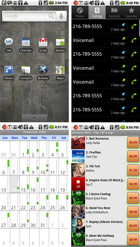
Here's a look at views from 4 android apps that came with my Droid. On the top, we have the home screen and the call log. Both are clean and engaging. I really enjoy the super-minimal black table or the call log with the clear hierarchy in the type size and value. The simple icons with their bold colors and clean lines make it a perfect "information-heavy" interface to my eye. This style is carried through many menus such as contacts, settings, chat and more. Good stuff.
On the other hand, the bottom two images are the Calendar and Amazon MP3 apps. I'm not here to critique, but it seems obvious that they didn't receive the same kind of attention. So to me, this feels inconsistent - like the top two screens, and the bottom two come from different worlds. I expect this from third party apps, but for the native apps that make up the core of the system, its a bit jarring. Its one example of a design disparity that I find throughout the OS.
update: the upcoming Android 2.1 (pics) looks like it could address some of these issues. Each update so far has been a big improvement.
Typography
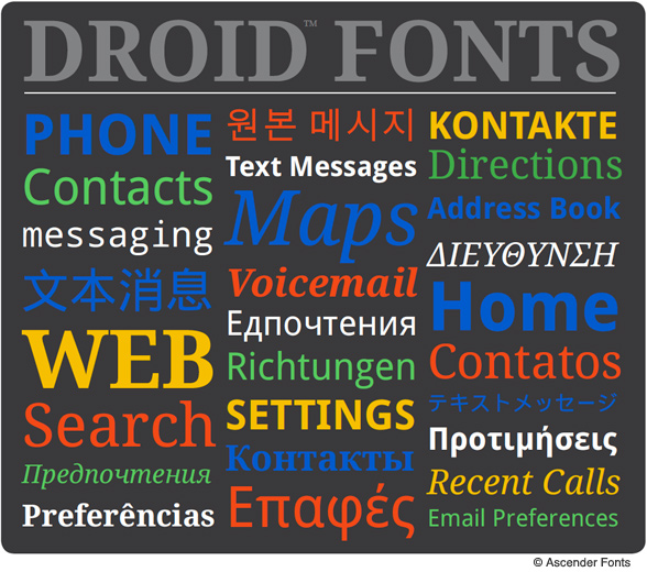
Android OS gets points in my book for making use of its own custom type family, Droid. Designed by Ascender Fonts, I won't say I like it better than Helvetica (which iPhone OS uses as its system font), but it's a well designed family custom made with portable gadgets in mind, and I feel it's successful.
Droid is slightly condensed with a tall x-height and is especially attractive in all-caps. I really appreciate the slabby serif version, which has a nice script-like oblique style as well. There are even 2 monospace weights, though they seem a little less well-considered (due to awkward letter spacing and some really compressed letters), I'm sure they can really come in handy. Interestingly, the droid family is more similar to the OS X default system font, Geneva (again, slightly compressed, tall x height) than it is to the iPhone font. The family has a lot to do with the overall personality of the OS. It works well at small sizes, friendly, legible and neutral.
The fact that it has several styles (with more to come), several weights, and even has custom international and Asian character sets make it a much broader system-type palette than the iPhone flavor of Helvetica which pretty much boils down to Bold and Regular right now (and will of course never have mono or serif versions).
Droidfonts.com has more information about the font, including detailed information about the making of Droid, detailed type specimens and more. The font is included in the Android SDK, and you can purchase pro versions of the font at here at Ascender's site.
Next: OS Conventions

great info. thanks for the write up
ReplyDelete