1. Aesthetic Impressions
2. OS Conventions (you're here!)
3. Design Challenges (later this week)
I was planning on writing a comprehensive look at many of the UI conventions found in Android, but I ended up focusing in on a few specifics. This is largely from my perspective as I think about designing for this platform.
Hardware buttons
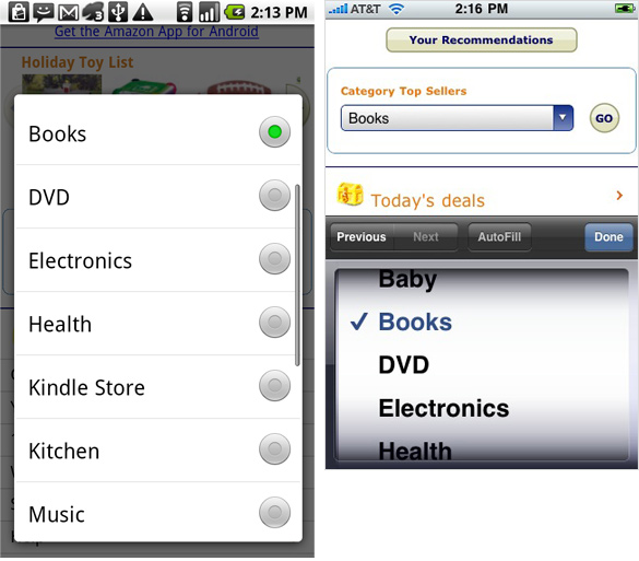
The iPhone philosophy is to eliminate as much of the physical controls on the phone as possible, the idea being with a touchscreen, each piece of software can render whatever controls it needs at the time. I mention this because its a distinguishing concept of the iPhone, and one of the key differences between iPhone OS and Android.Android requires at least 4 dedicated hardware buttons on the device: Back, Menu, Home, and Search. When you add in other standards like volume, sleep, camera, etc you've got 7+ hardware controls compared to the Iphone's 4. On the downside, this adds some complexity to the design of devices running Android. However, there are some advantages. I appreciate always knowing where my "back" button is. This is a convention we've all learned to rely on with web browsers, and its definitely a handy control here. It's nice that I never have to hunt around for a way to back out of a menu or view regardless of who designed the app. An additional bonus for the back button is that it results in very clean modal select lists and tables in general. No additional UI space need be relegated to "cancel" or "return" buttons.

Select Lists on the iPhone vs Android. The iPhone has to draw extra buttons around the select menu, and its not always clear where to put them...
The same goes for the menu button. This serves as contextual options for the app or view you're currently dealing with. Knowing this menu is always available can be handy. Developers benefit from the convenience of not having to add UI to their apps to handle things like options menus. "Options" tends to be one of those things that each developer tends to treat differently on the iPhone. Is it a choice from the main menu? A persistent "info" button on every view? Or is it one of the main tabs at the bottom? Every app is different, meaning users have to hunt for where to access this from app to app. A standard button for the menu is helpful.
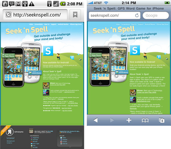
Here's a specific example: The browser:

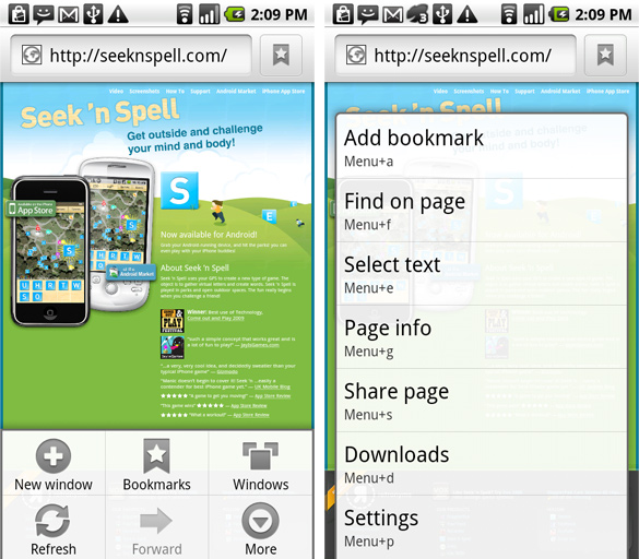
Both have space at the top for address and search, but notice that the iPhone adds a bar at the bottom for back/forward navigation, bookmarks, and access to multiple windows. Android doesn't have to eat up space with this bar, as those options are in the standard menu button (and of course, "back" has its own dedicated button). The downside is that access to history or windows requires an extra tap on android (mitigated by the fact that this tap is in a standard location, one you are well-trained to know). But there are actually 2 benefits: 1. the valuable space you save on the screen. 2. Access to even more advanced features via the standard "more" button. Lets take a look:

There are several things here that aren't available in the iPhone Safari (including find-on-page, Page Info, and Downloads). More importantly, adding more items to Safari will require an significant overhaul of Safari's menuing UI, whereas taking on another advanced option (read page out loud anyone?) in Android's browser is as simple as adding something to that list. And are those keyboard shortcuts I see? (yes)
As long as we're talking about browsers, I REALLY appreciate find-on-page, The bookmarks UI, and the extensive settings menu in Android's browser. In terms of power, it trumps iPhone Safari at every turn. On the other hand, if you're not using those advanced features. The experience of Safari is still generally better due to its better zooming, and smoother panning.
Haptic Feedback
This is a relatively minor point, but I was excited to find that Android makes use of something most touchscreen UI's lack: Haptic Feedback. Android uses the phones vibration to give you some tactile feebdack on when you've tapped certain buttons or started certain events.For example, tapping any of the hardware buttons on the bottom of the device give you a tiny, just-perceptible nudge back. As the buttons on the Droid don't have any tactile qualities (they are simply painted on the surface), this is a welcome confirmation that I've actually tapped one (intentionally or otherwise).
A similar "bump" occurs with many events that require a "hold" action. For example, to drag an application icon around the homescreen, you hold your finger down on it for a second before it "releases" and becomes draggable. Getting a little bump when the release occurs makes it extremely intuitive.
It's a subtle effect and used sparingly, but one I like a lot.
Home Screen & Widgets
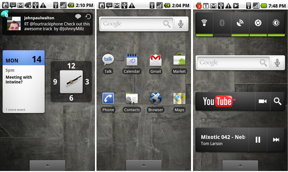
The Android Home Screen has three horizontal regions you can swipe between. As you swipe there is a parallax effect between the icons in the foreground and the background wallpaper. I like the effect, although on my Droid, the swipe animation seems a bit clunky, and drops some frames every time. Not nearly as satisfying as swiping between home screen views on the iPhone.
The home screen is very much like a traditional computer desktop, allowing you to organize application shortcuts, and widgets.
Widgets add functionality or information to your home screens. There are some standard ones included (Clock, Google Search Bar, Weather, etc), but more interesting is that app developers can also take advantage of the widget system to make widgets of their own. For example, Twidget is a 3rd party app that displays the latest tweet from my feed right on the home screen.
Next: Design Challenges (later this week)

nice post! what happened to the 3rd part?
ReplyDeletethanks!
It is absolutely genuine that the Google telephones are turning out to be increasingly well known. This is presumably in light of the fact that the telephones being discharged now are designed according to the advanced cells that have ended up well known. Custom Rom
ReplyDelete